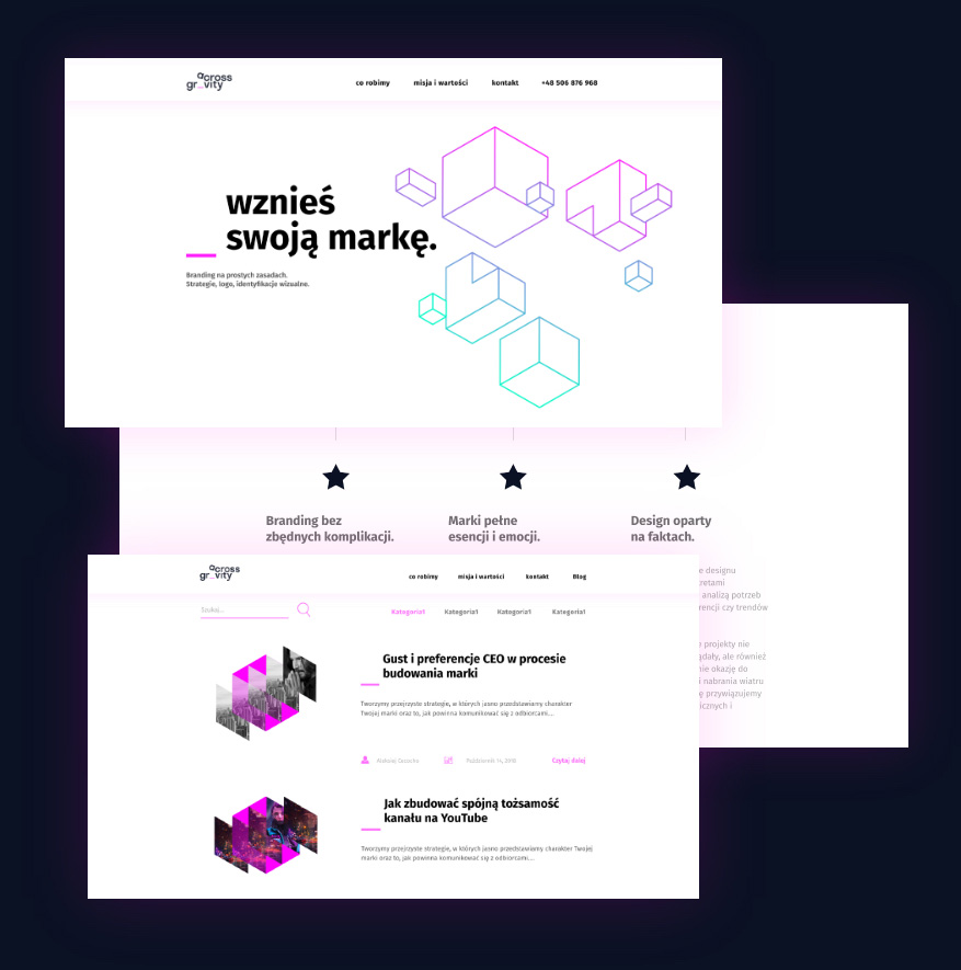


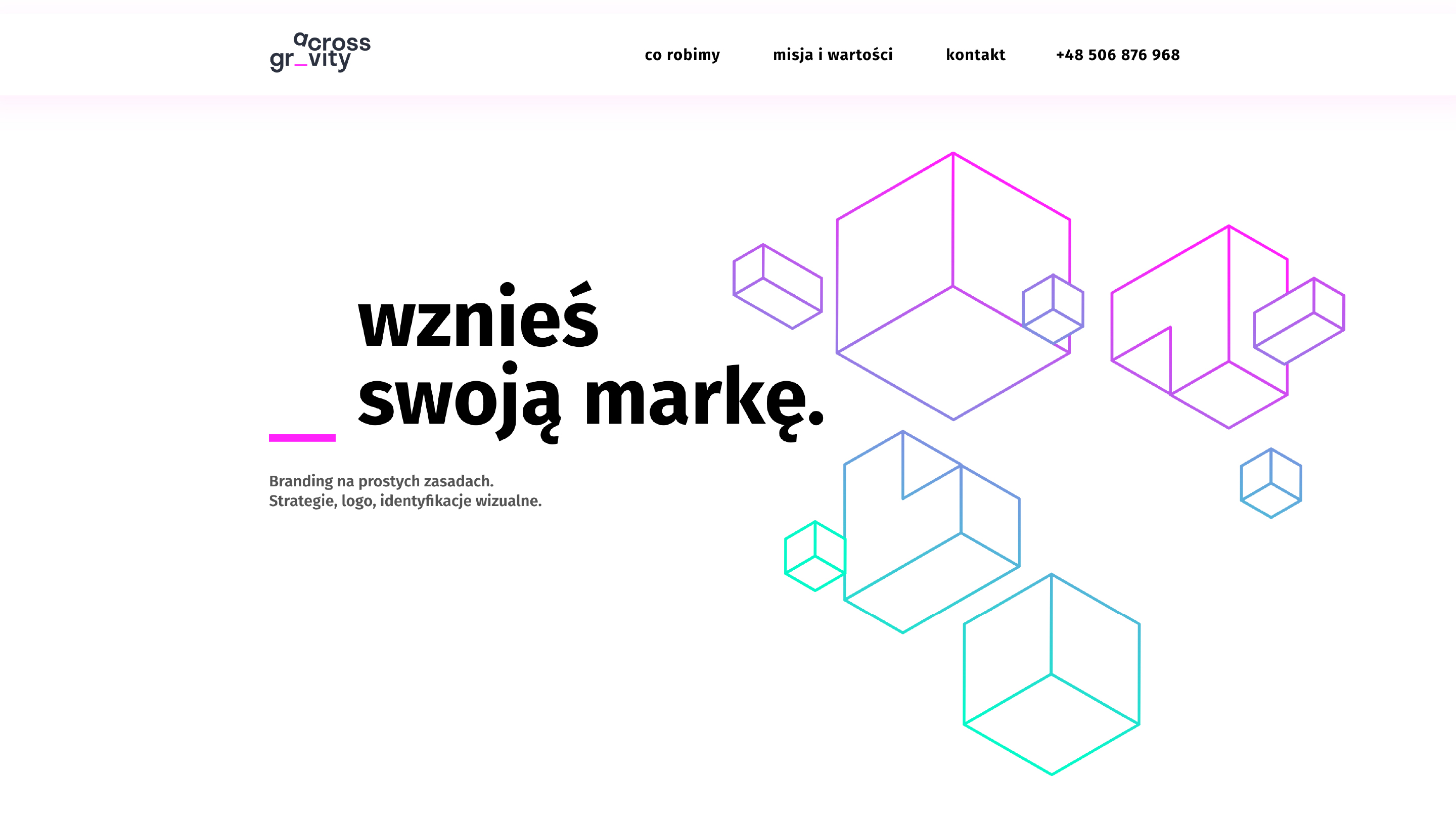
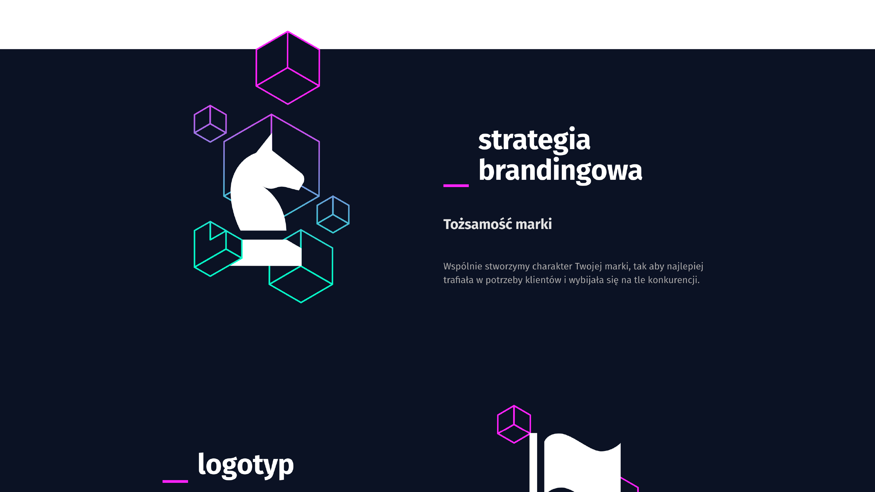
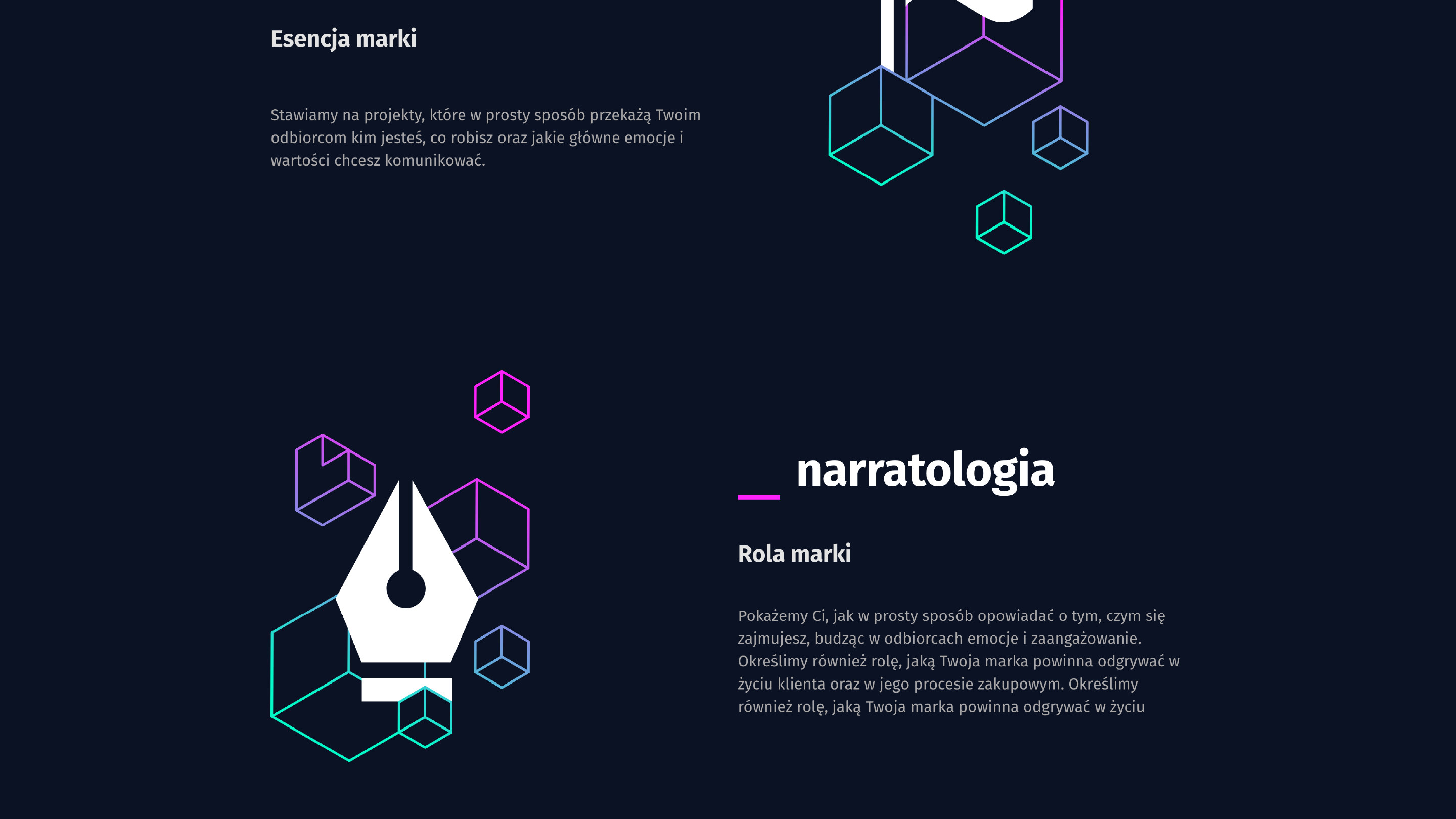
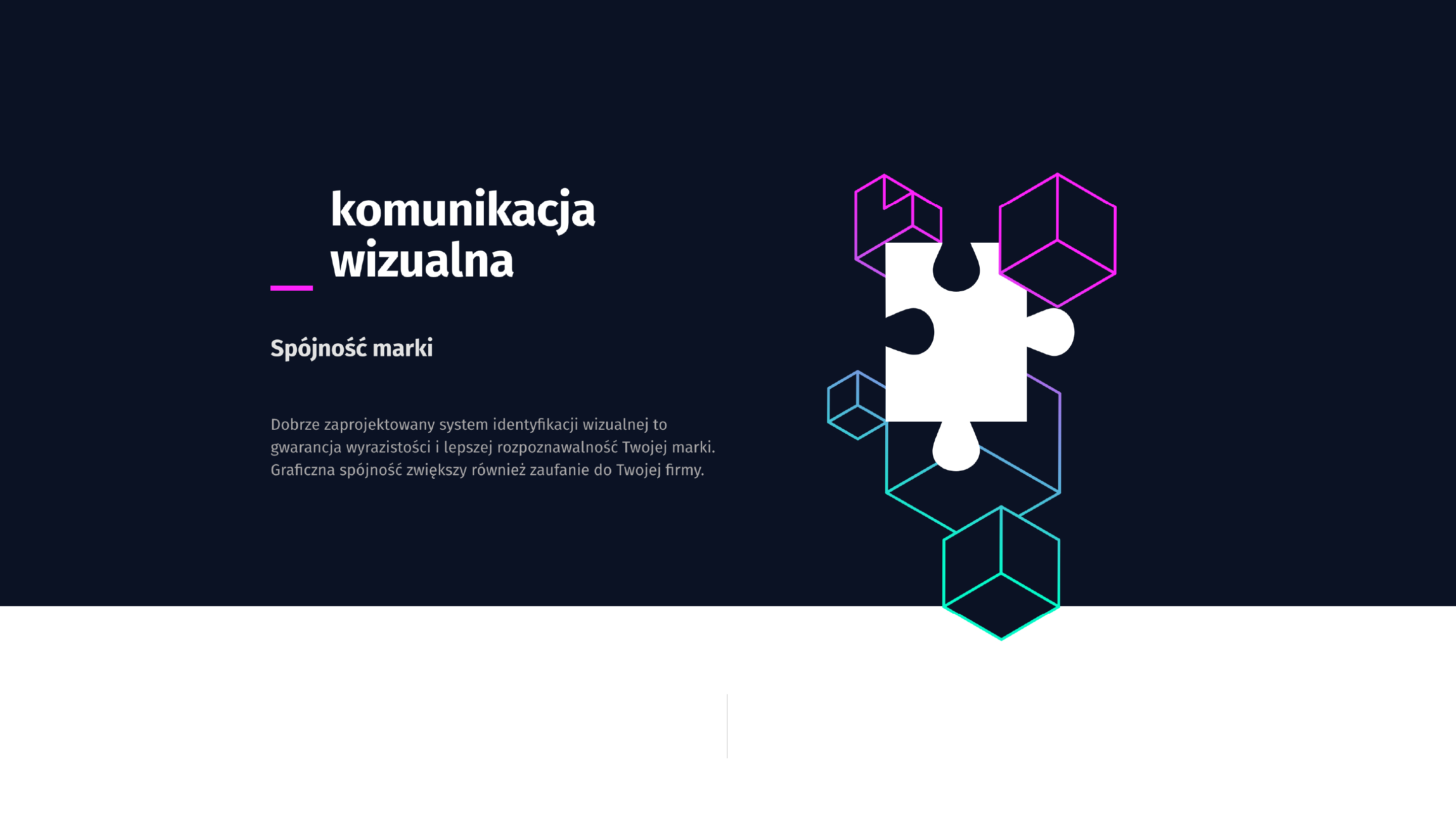
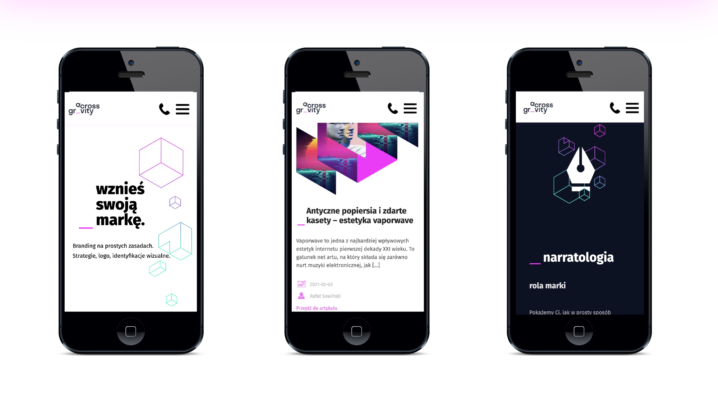
The aim of the project was to design visual communication based on the existing logo for Across Gravity – a company dealing with branding strategy. The main idea was to create a website whose main theme was light, linear cubes – an allegory for uncomplicated and flexible strategy building.
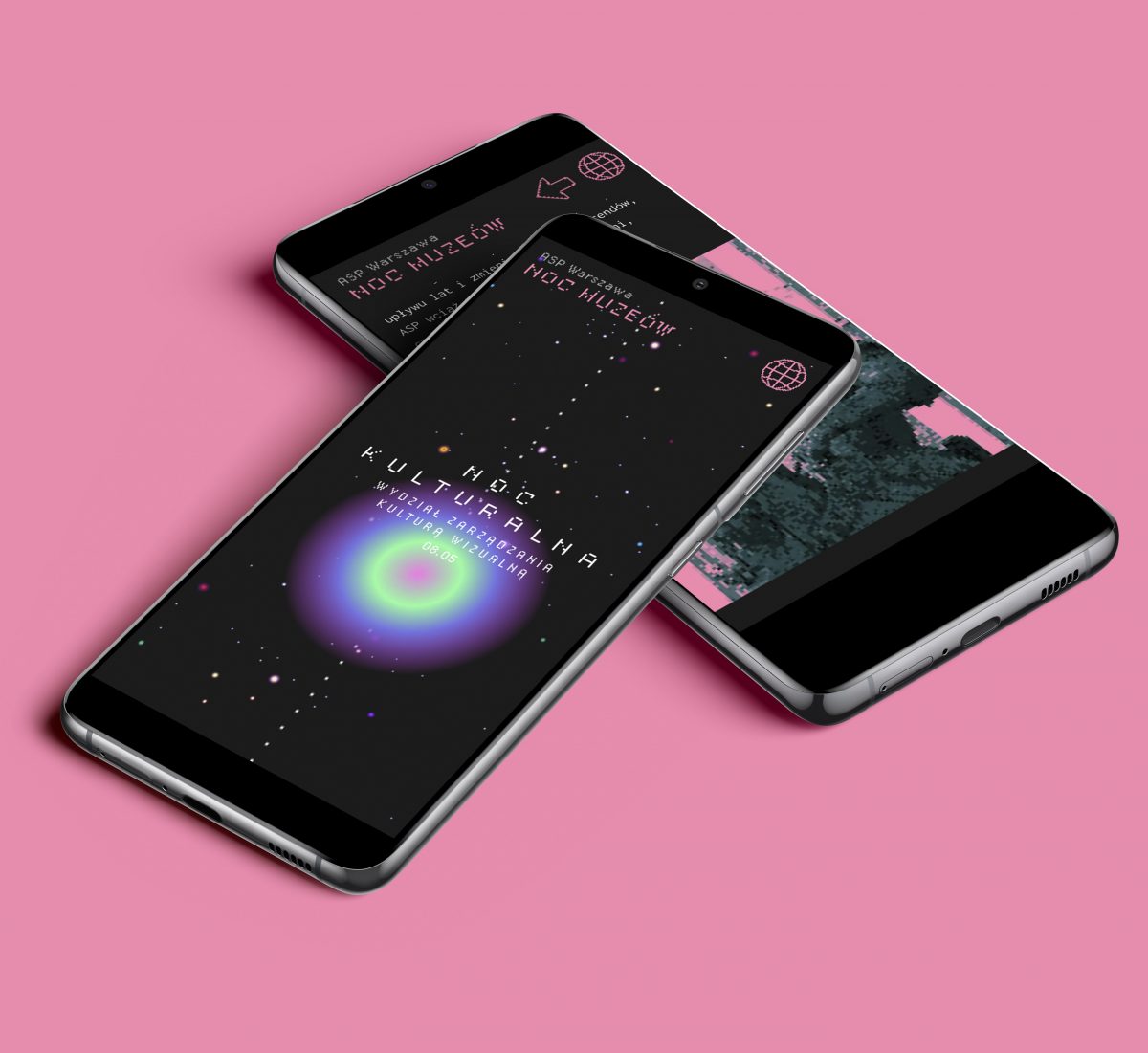
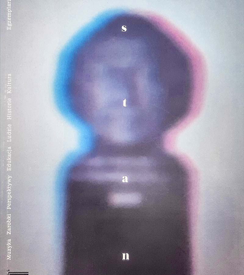
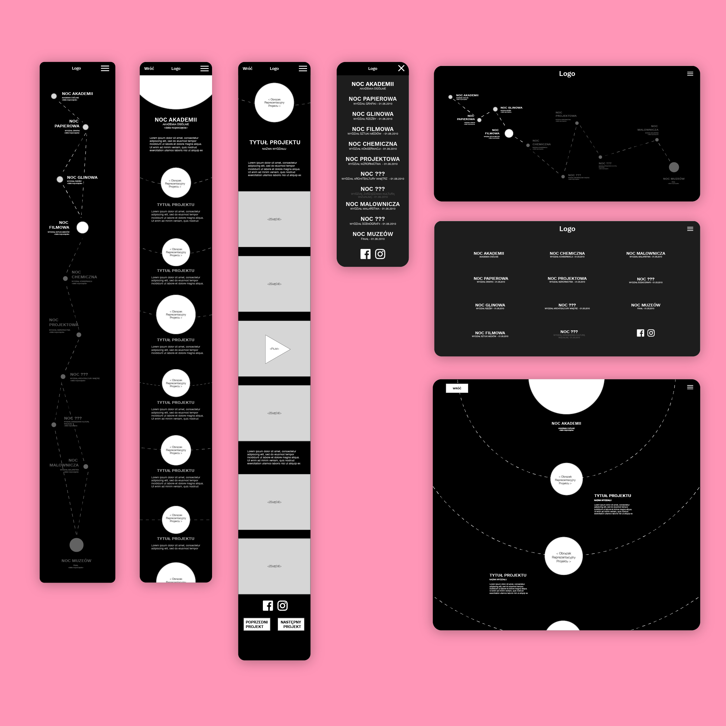
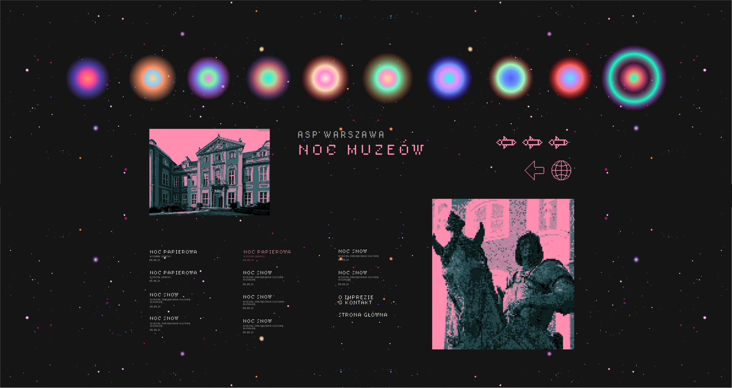
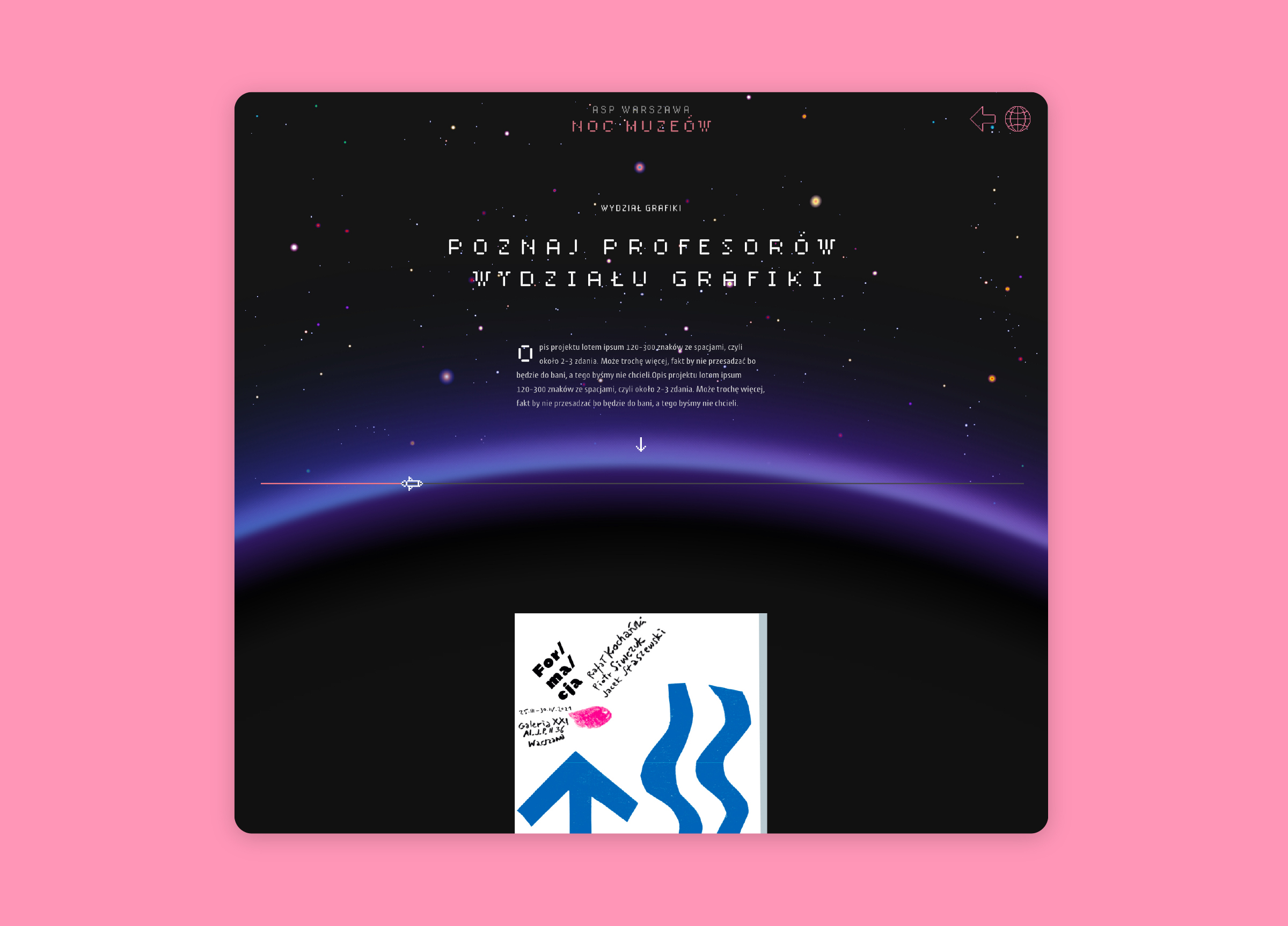
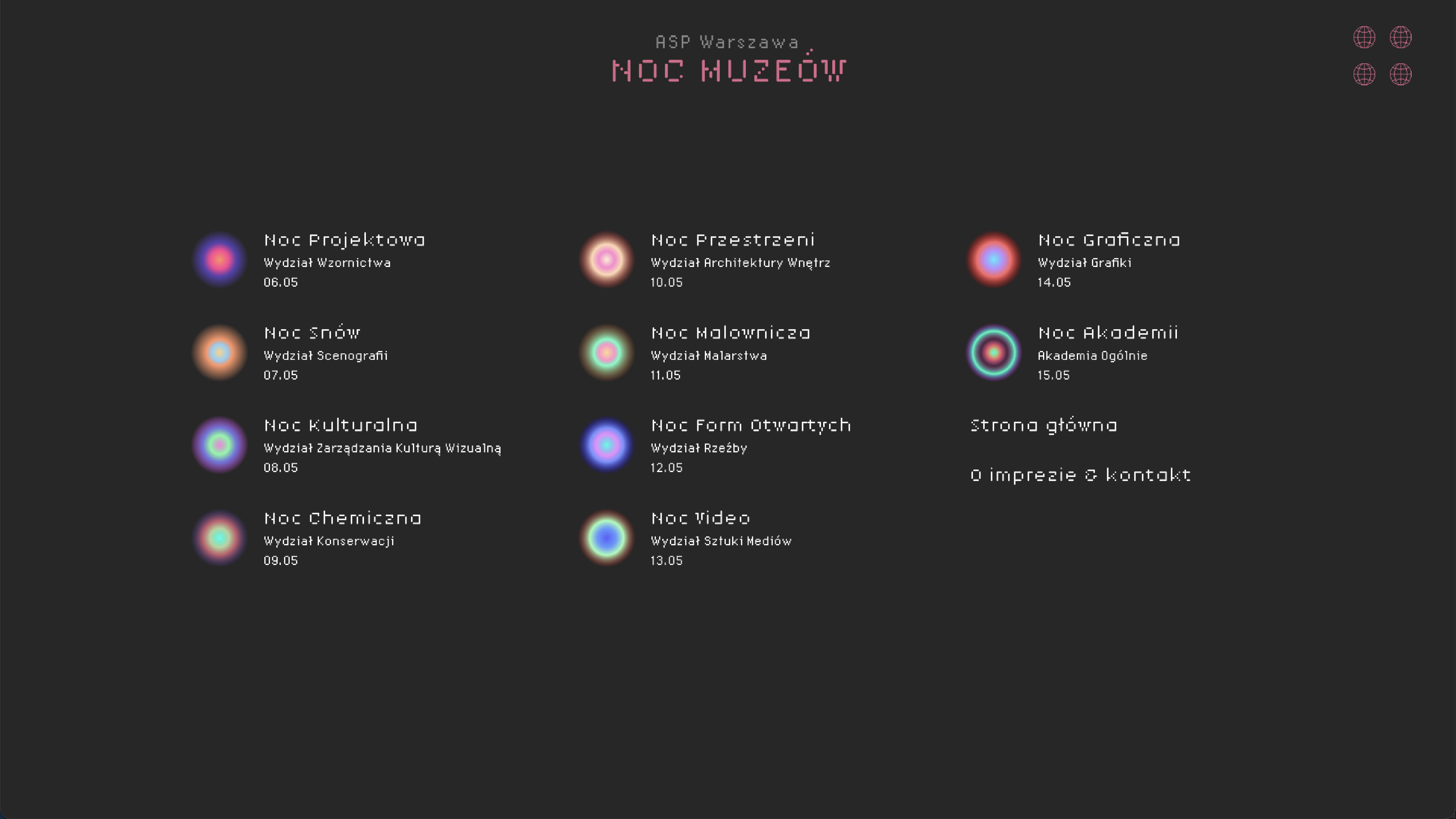
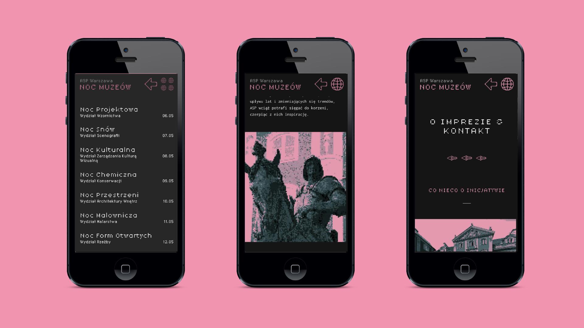
Project made at the request of the Academy of Fine Arts in Warsaw for the online event “Museum Night”. The event was online – due to COVID-19. For this reason, the university needed a specially designed and implemented platform that was to act as a gallery with both images and videos, including streams. According to the organizers’ plan, the event was spread over 10 days. Each evening during this period, the content of one faculty to which the night was devoted was made available (excluding the last night when all departments were available).
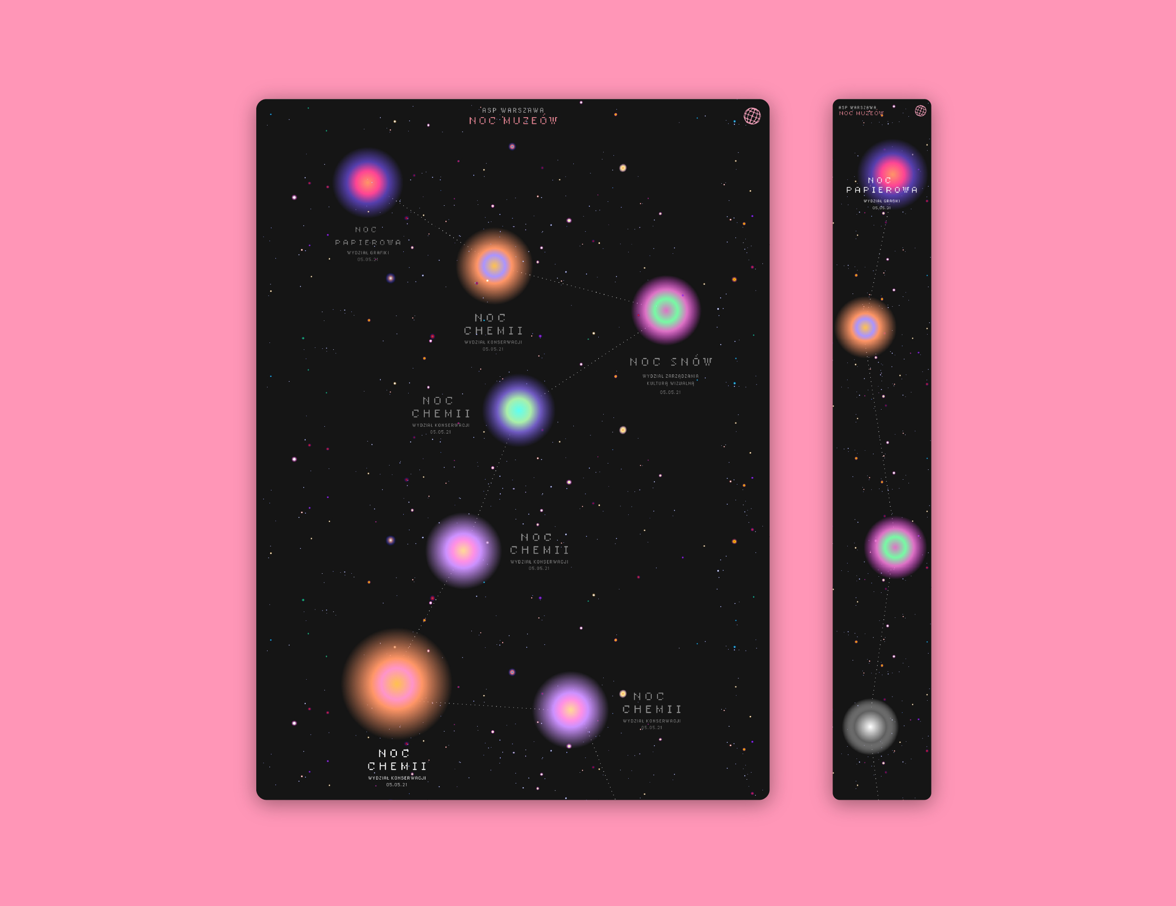
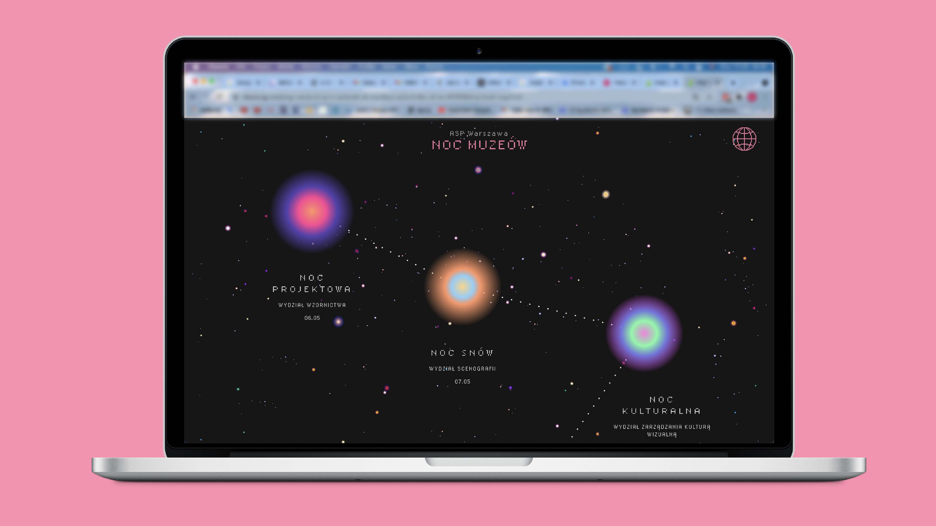
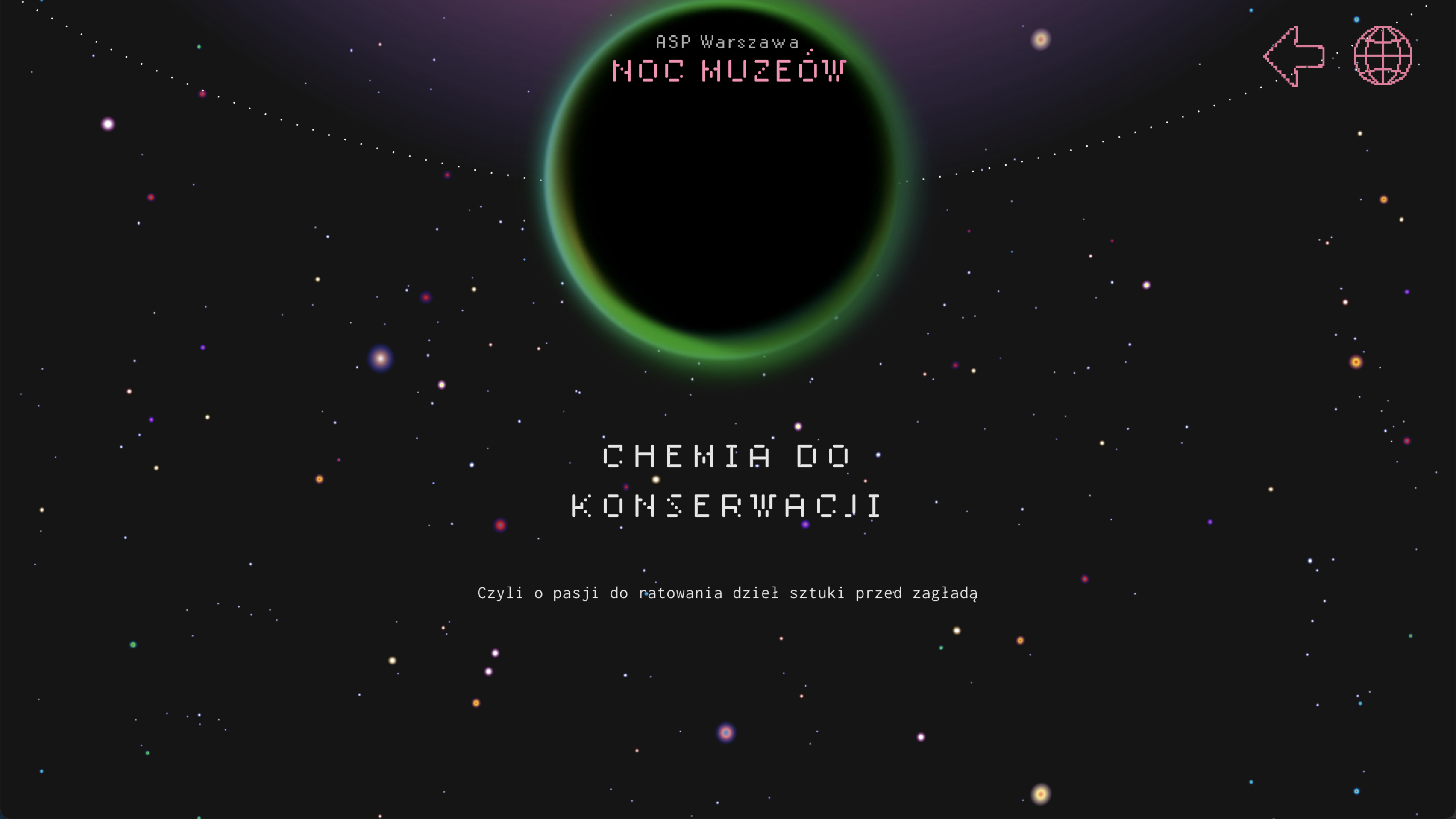
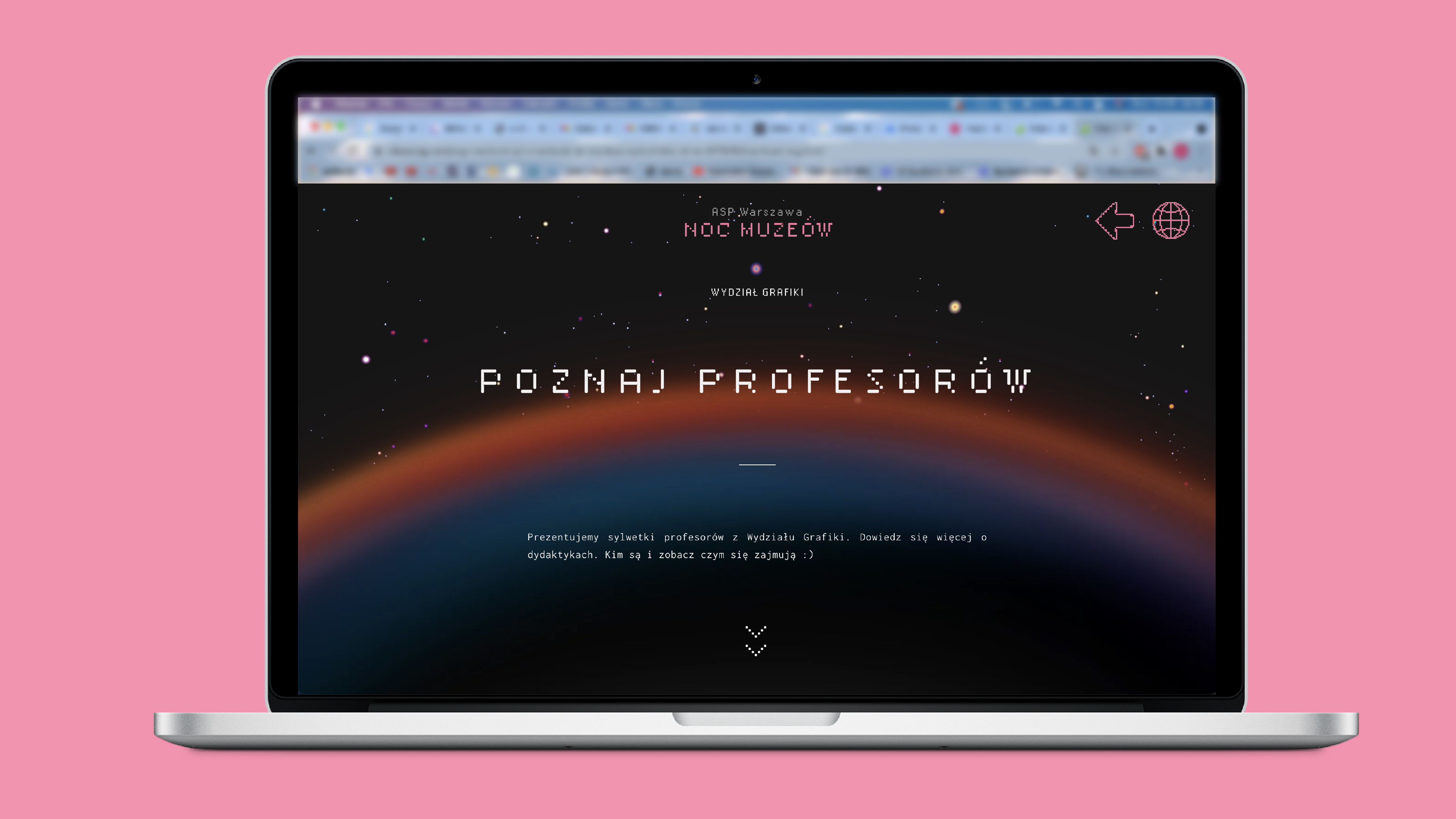
The main idea was relate page hierarchy to hierarchy of objects in space. Because we didn’t have any informations about the content size we decided to minimize the user flow to a minimum, and the content of the project – to lead linearly with loading subsequent fragments of content along with the user scroll.

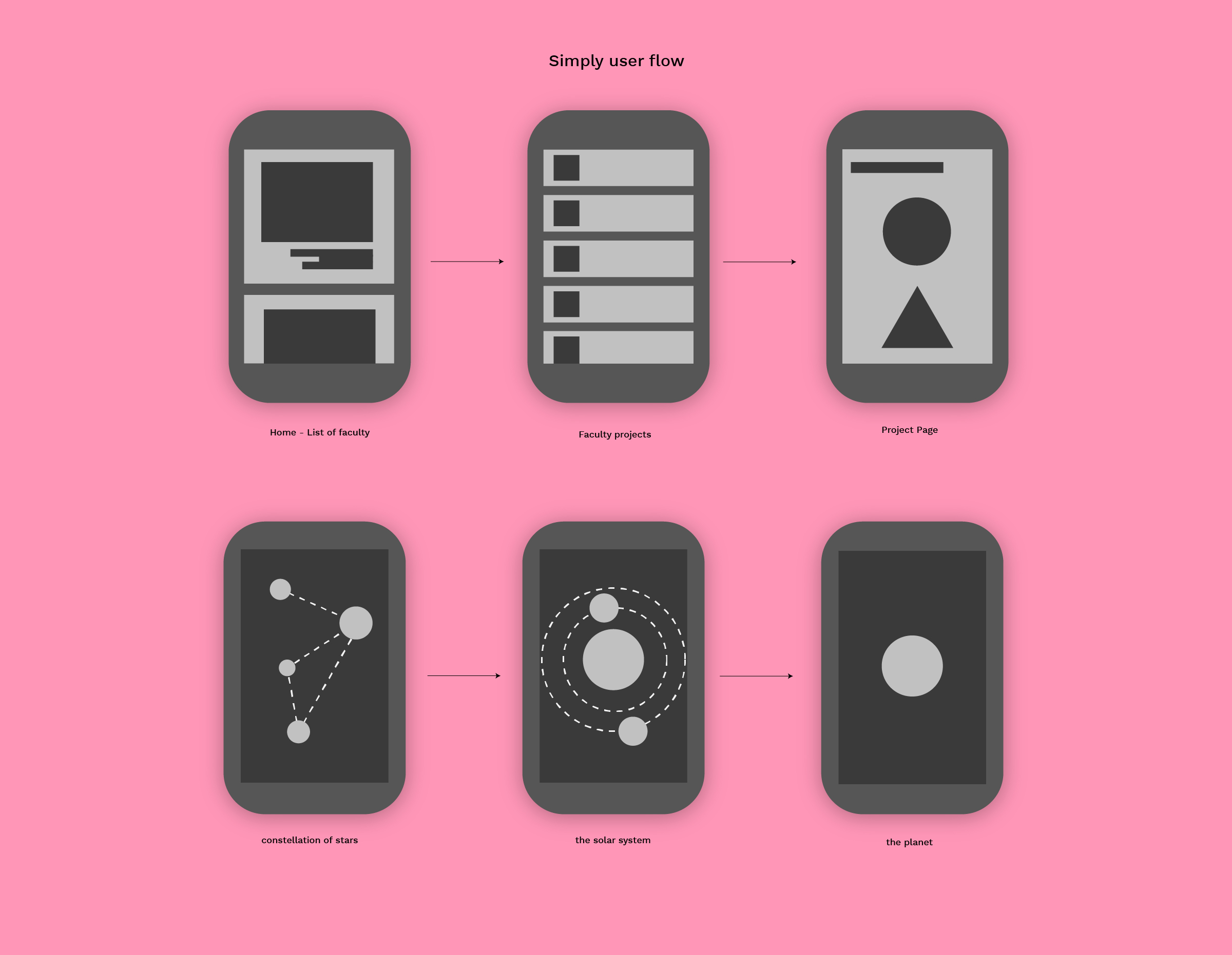
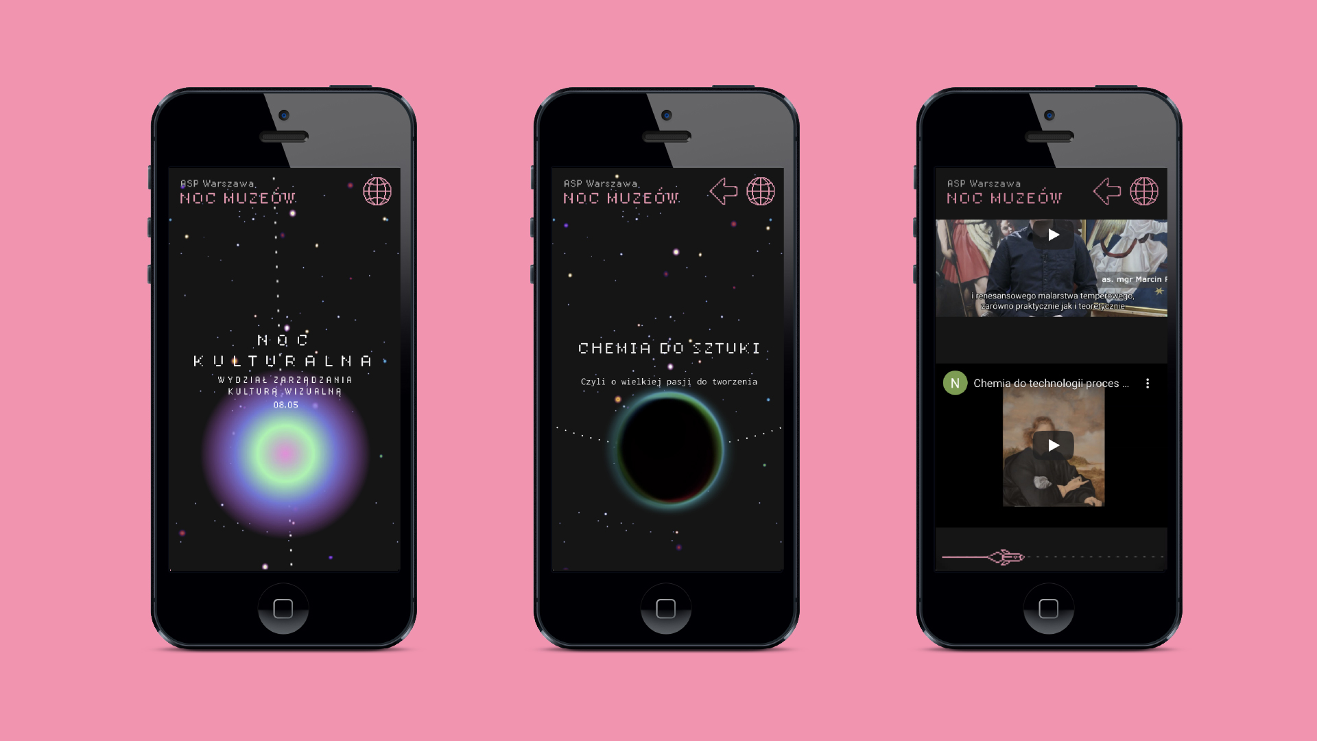
The leitmotif is the cosmos, it refers to the time in which the whole event takes place – the night, and is a tribute to the work of the Warsaw painter – Wojciech Fangor. The combination of art with a pixel-digital motif is a manifestation of the interpenetration of worlds – tradition with contemporary, digitized space. In this way, we wanted to show that despite the passage of years and changing trends, the Academy of Fine Arts is still able to reach its roots, drawing inspiration from them.
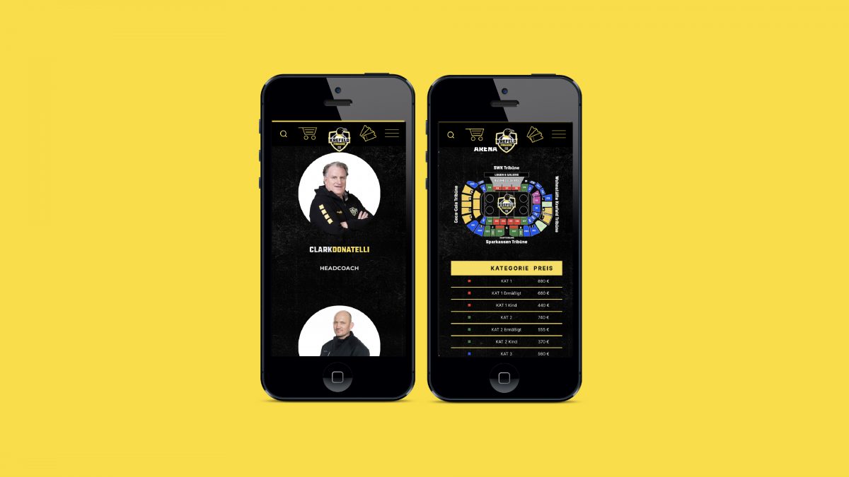
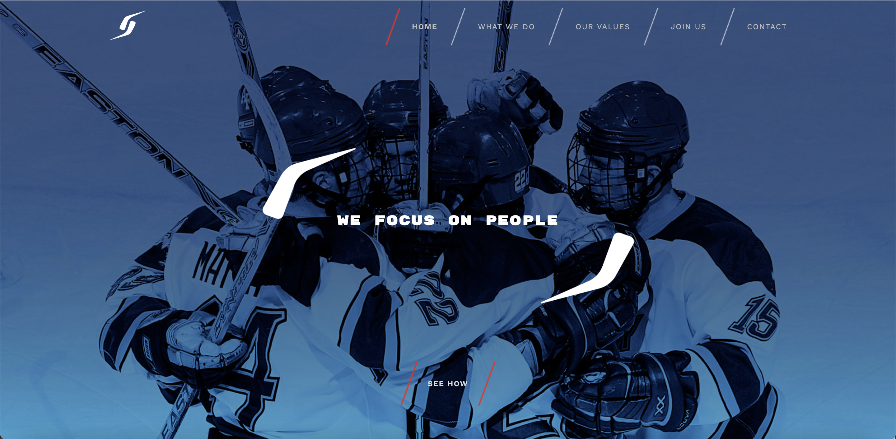
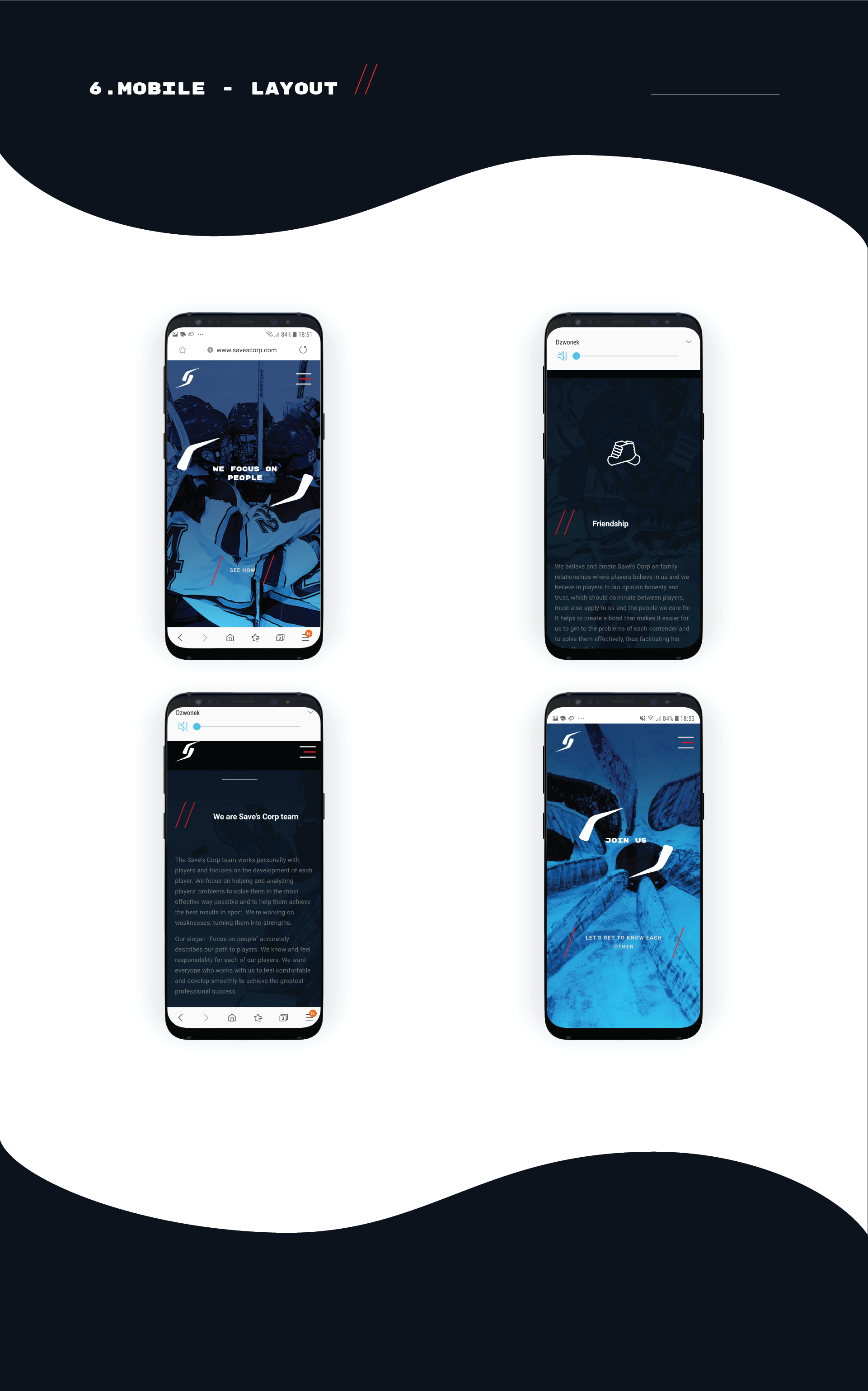
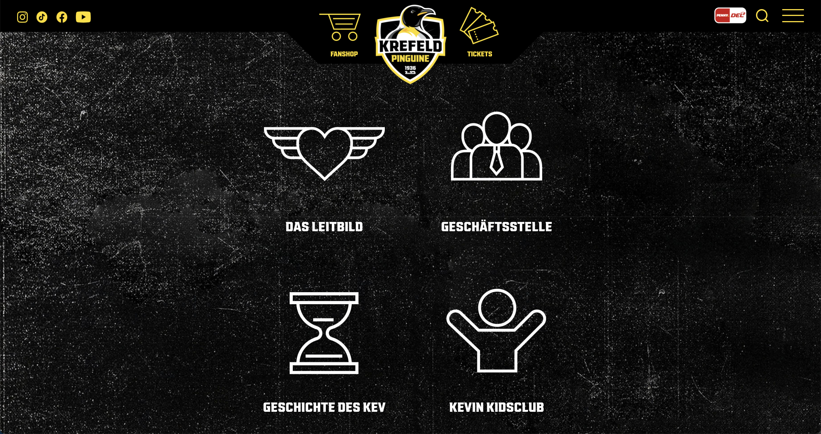
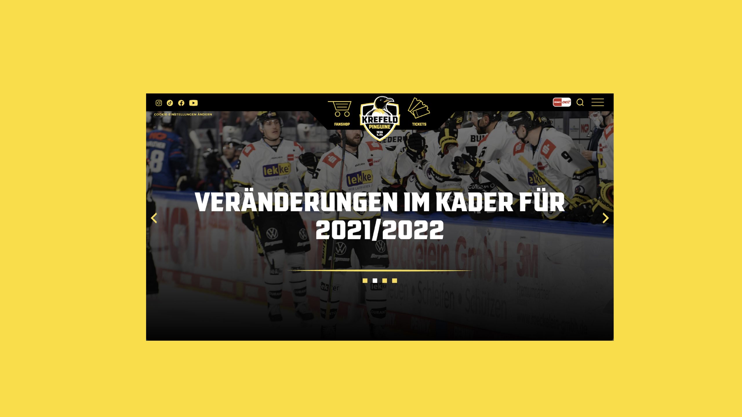
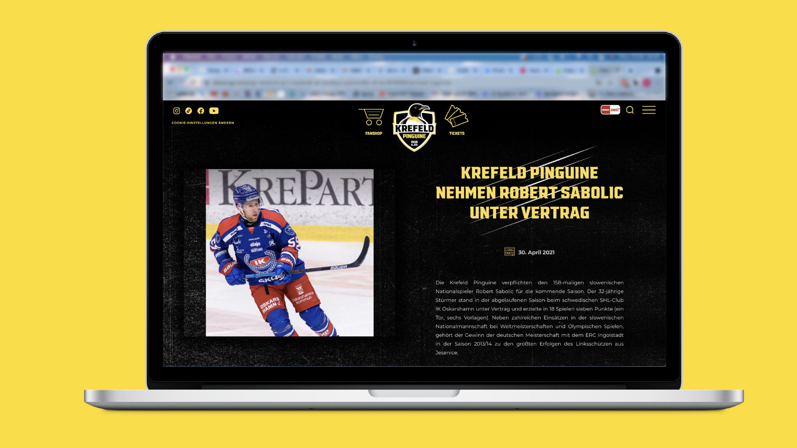
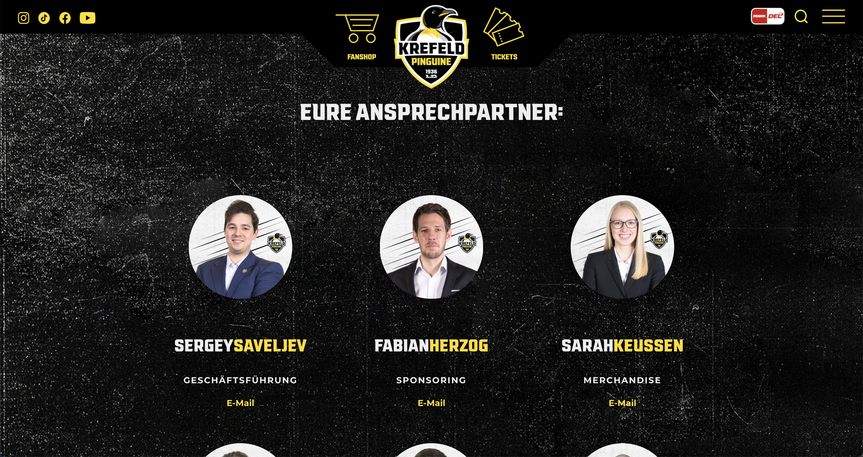
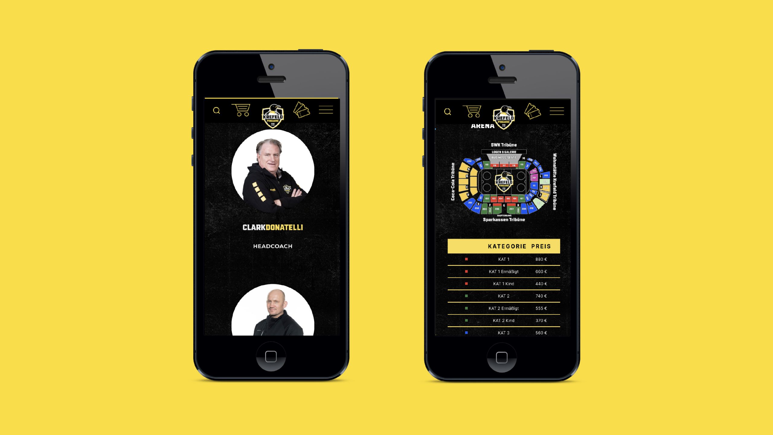
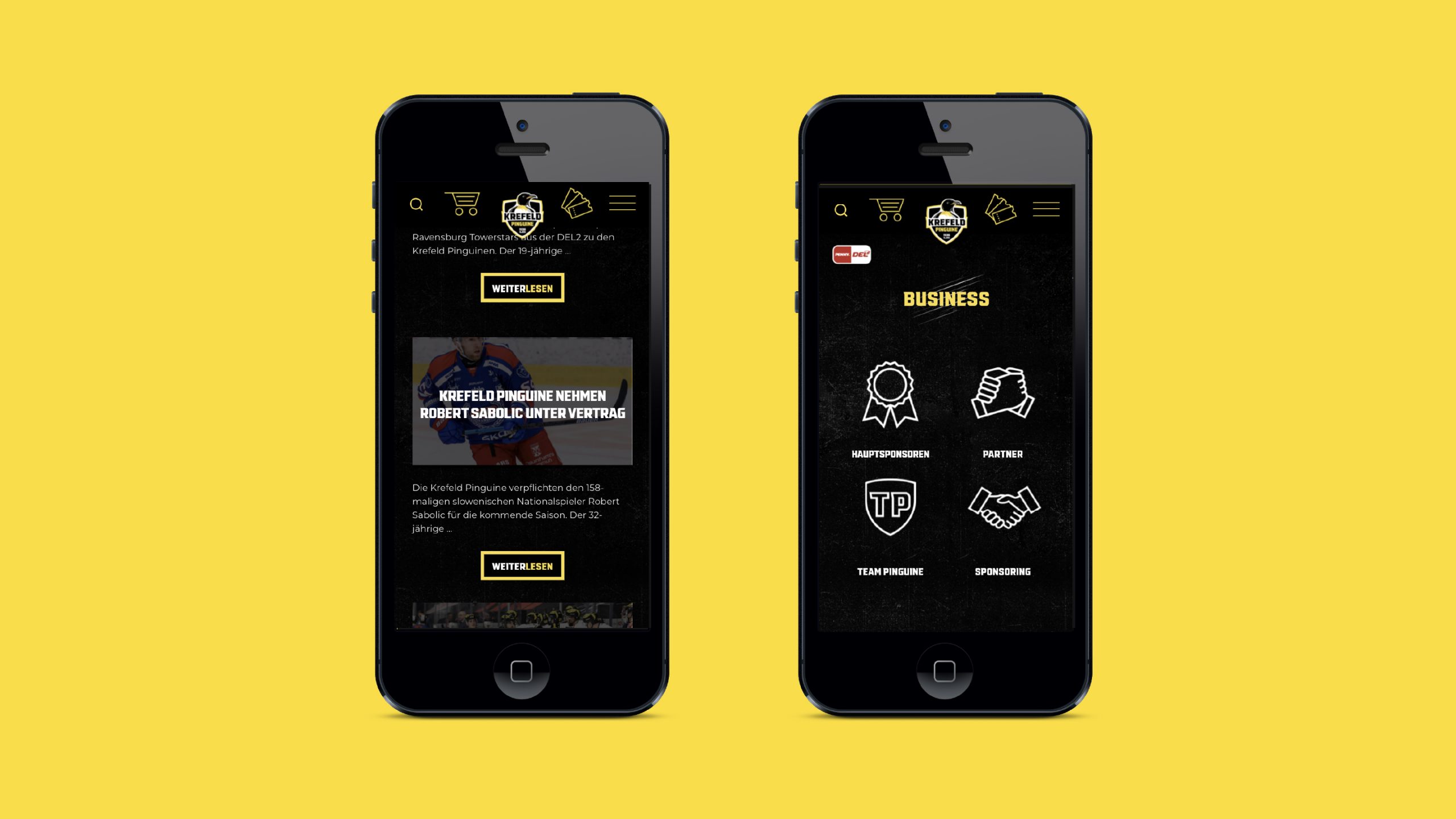
Website made for the Krefeld Pinguin hockey team. The graphic design of the website has been harmonized with the new visual communication of the team.
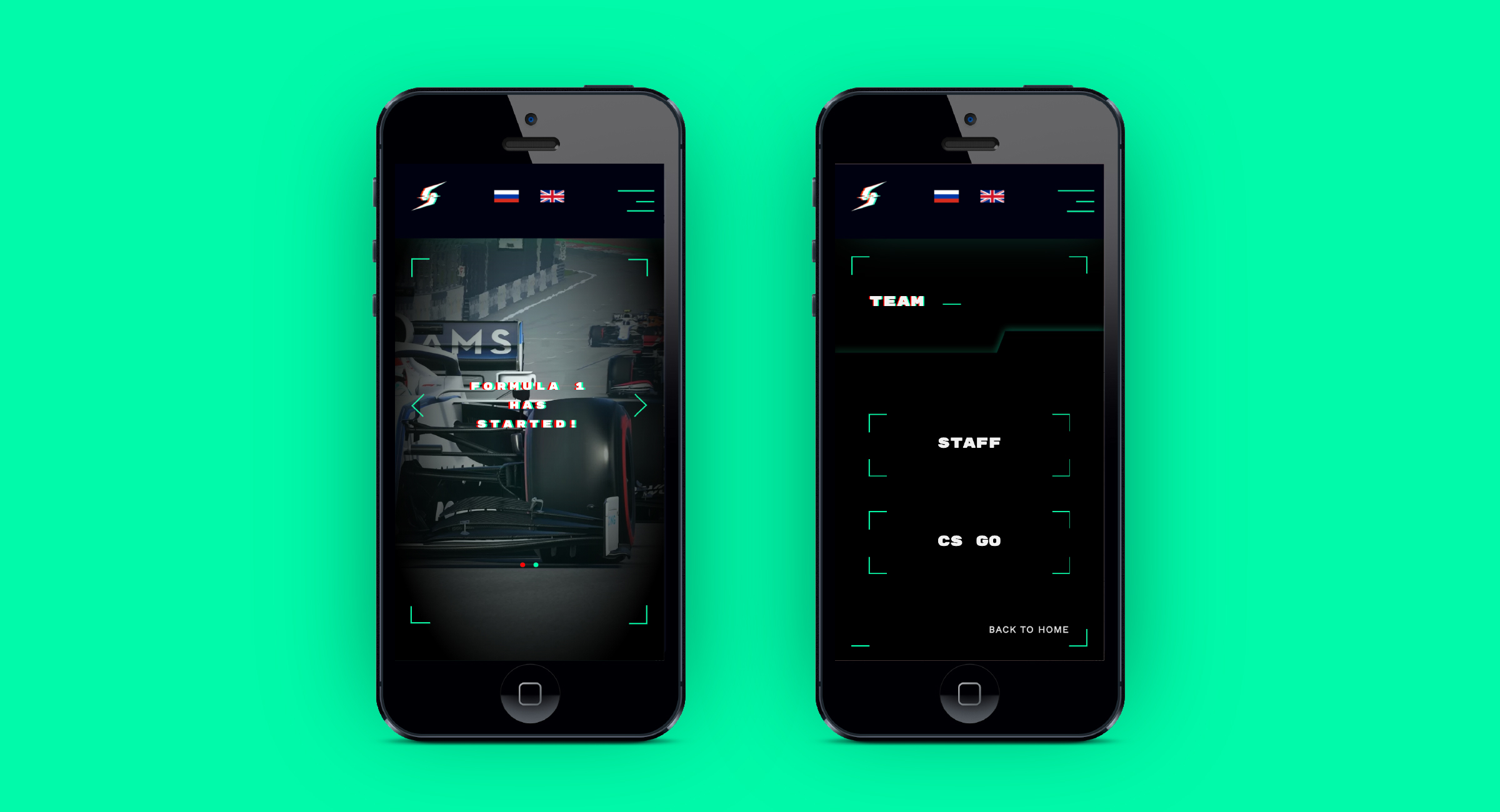
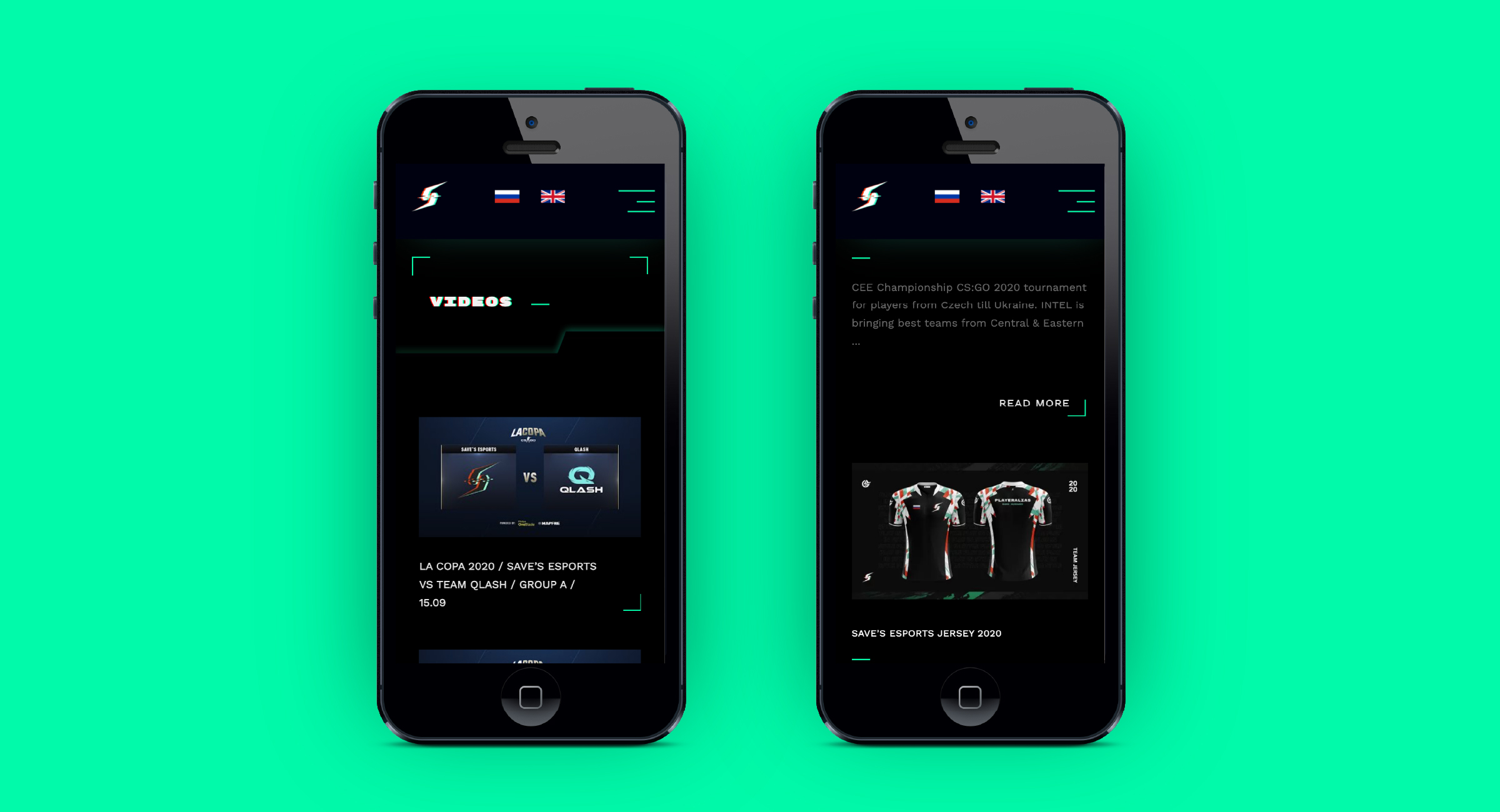
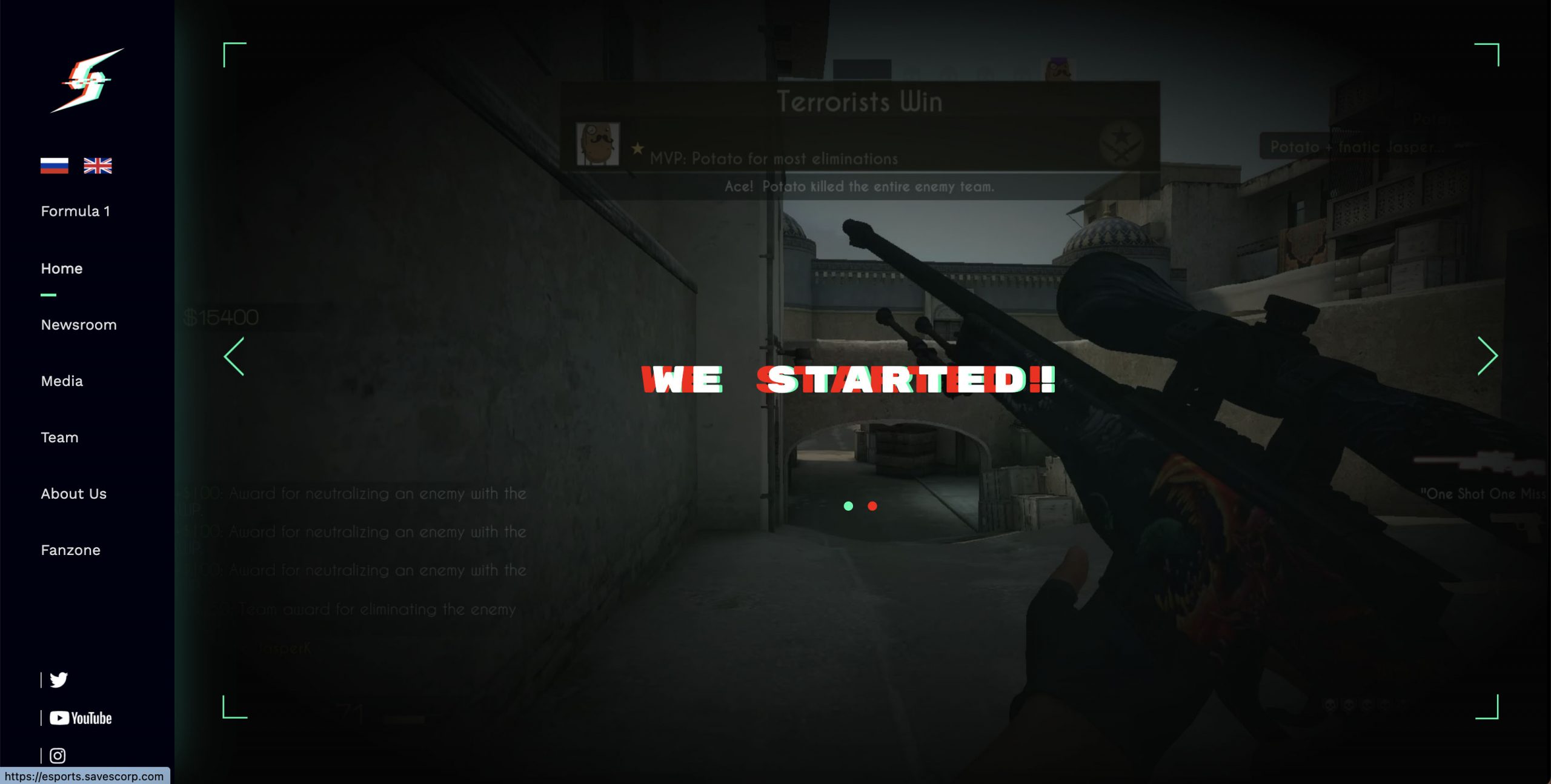
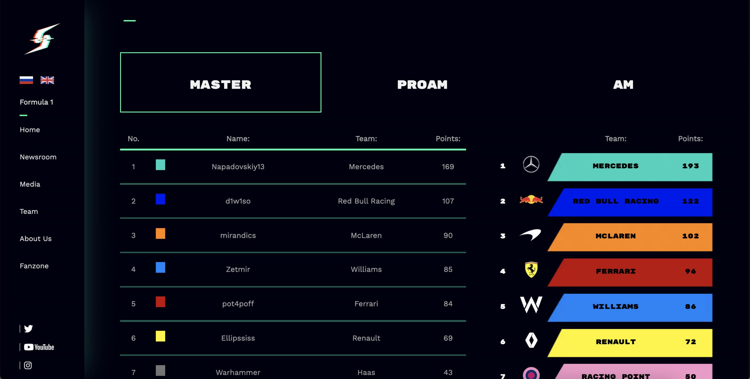
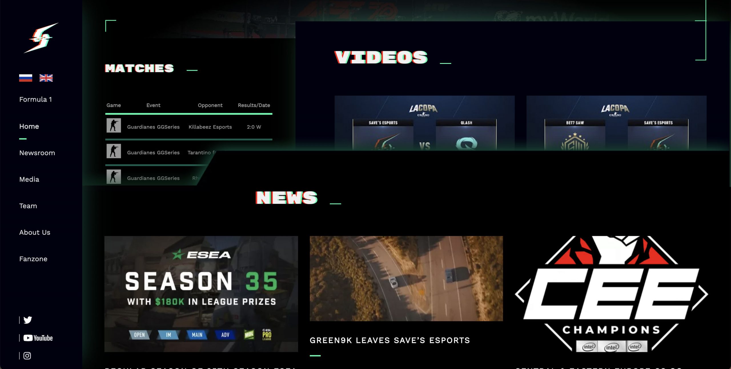
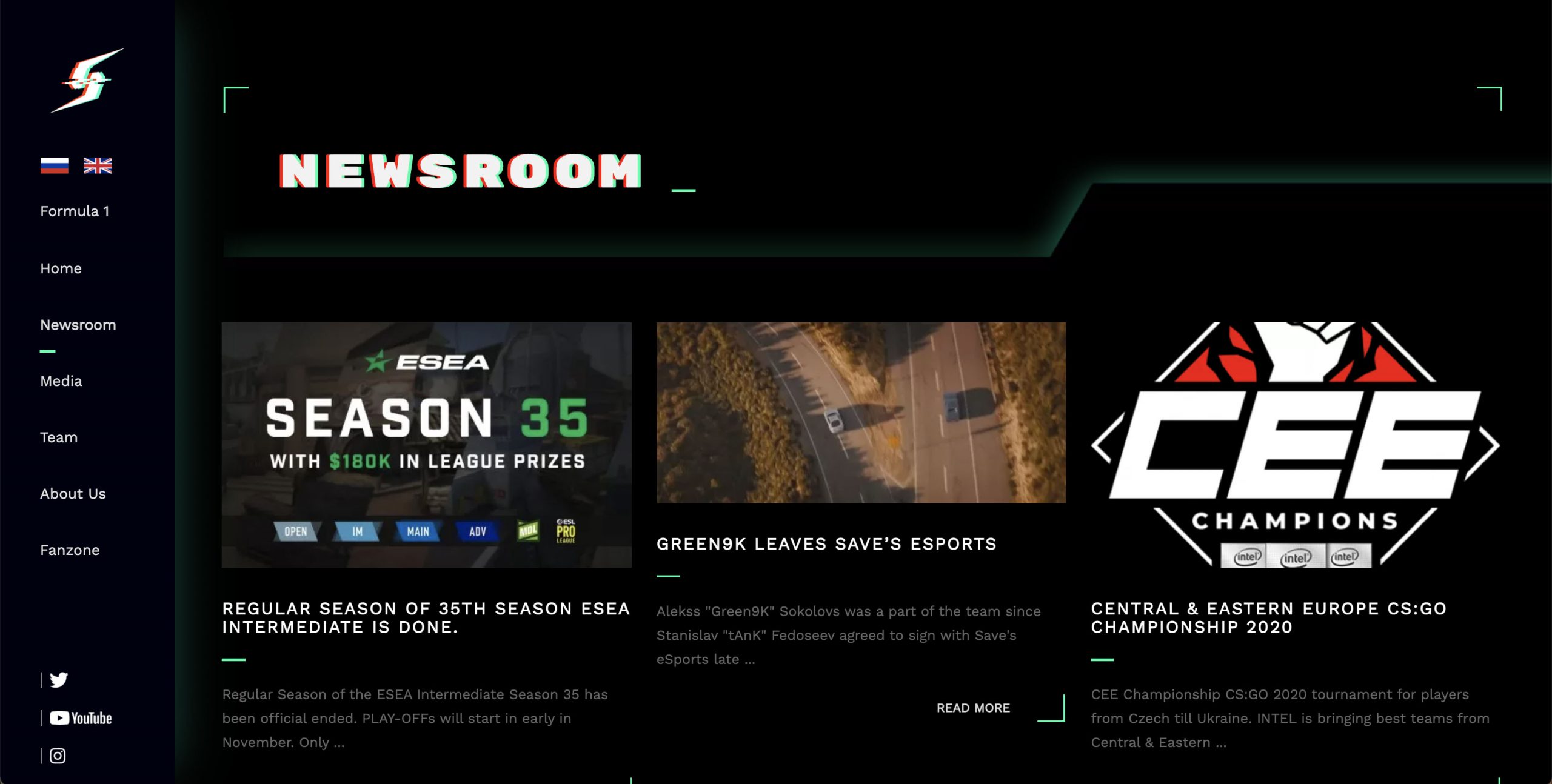
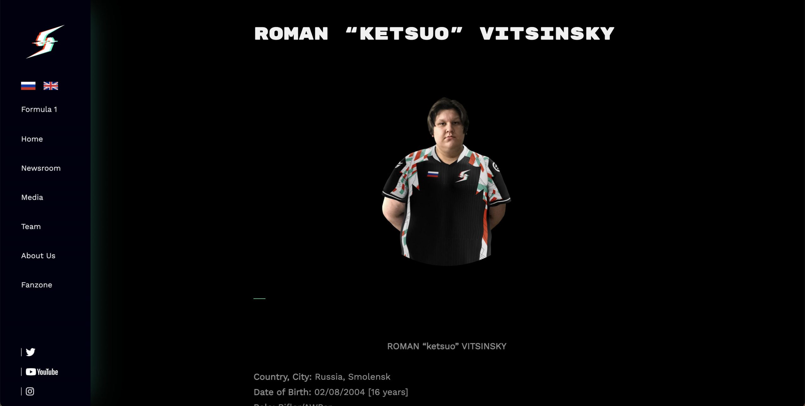
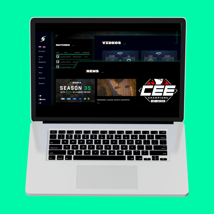
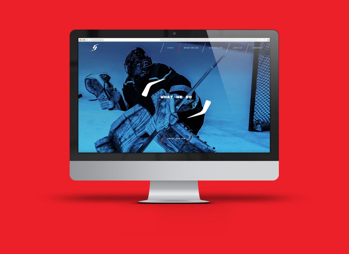
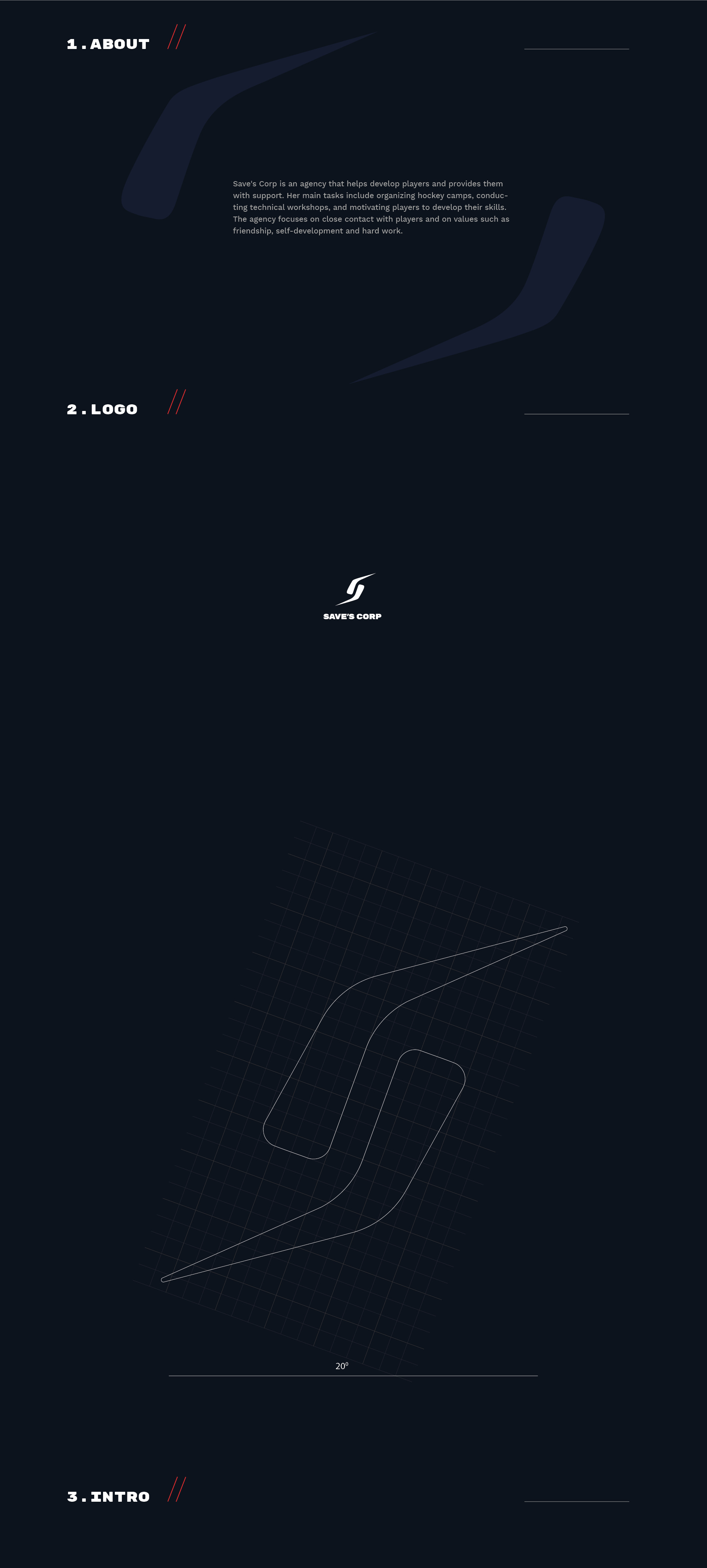
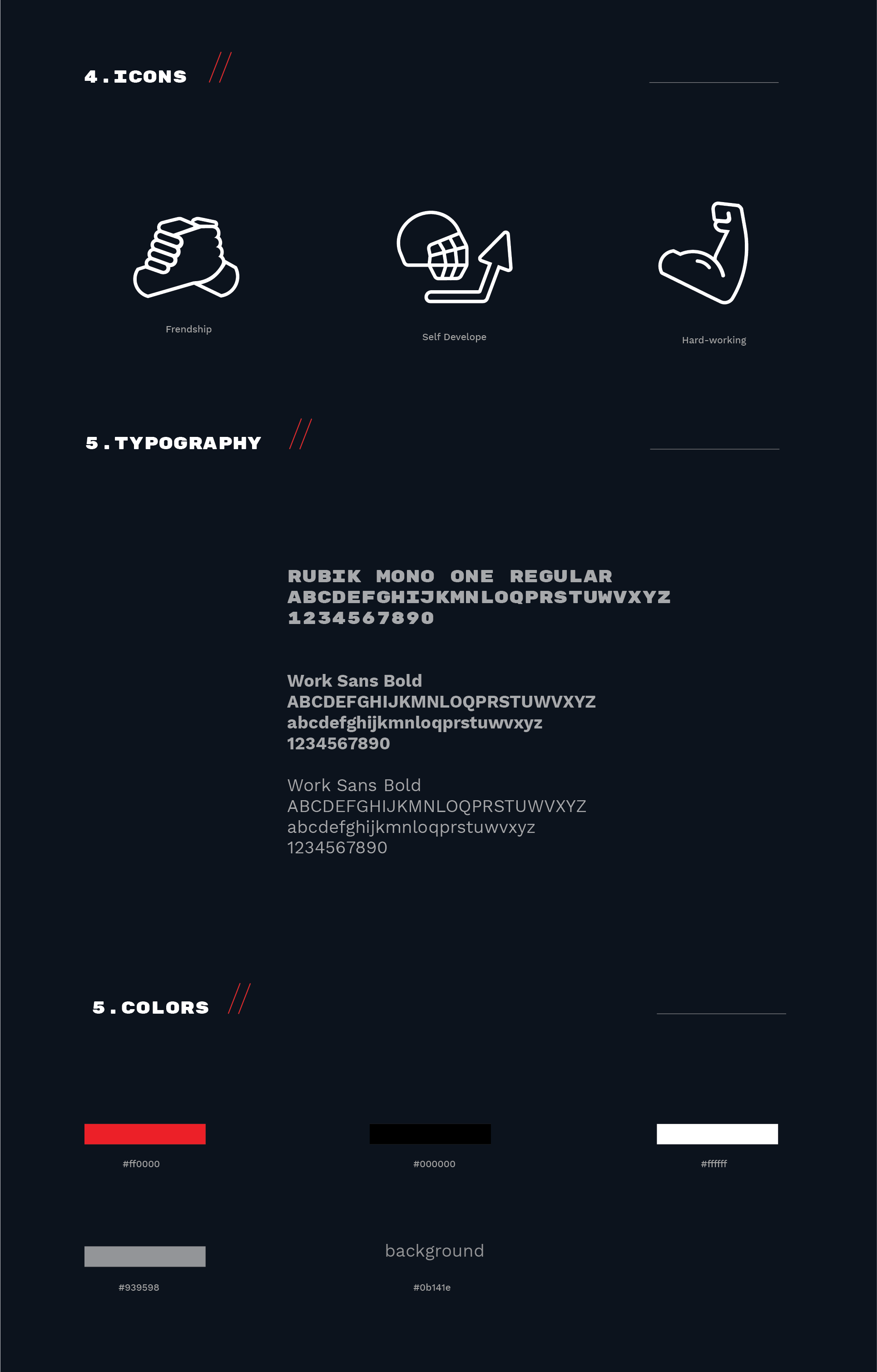
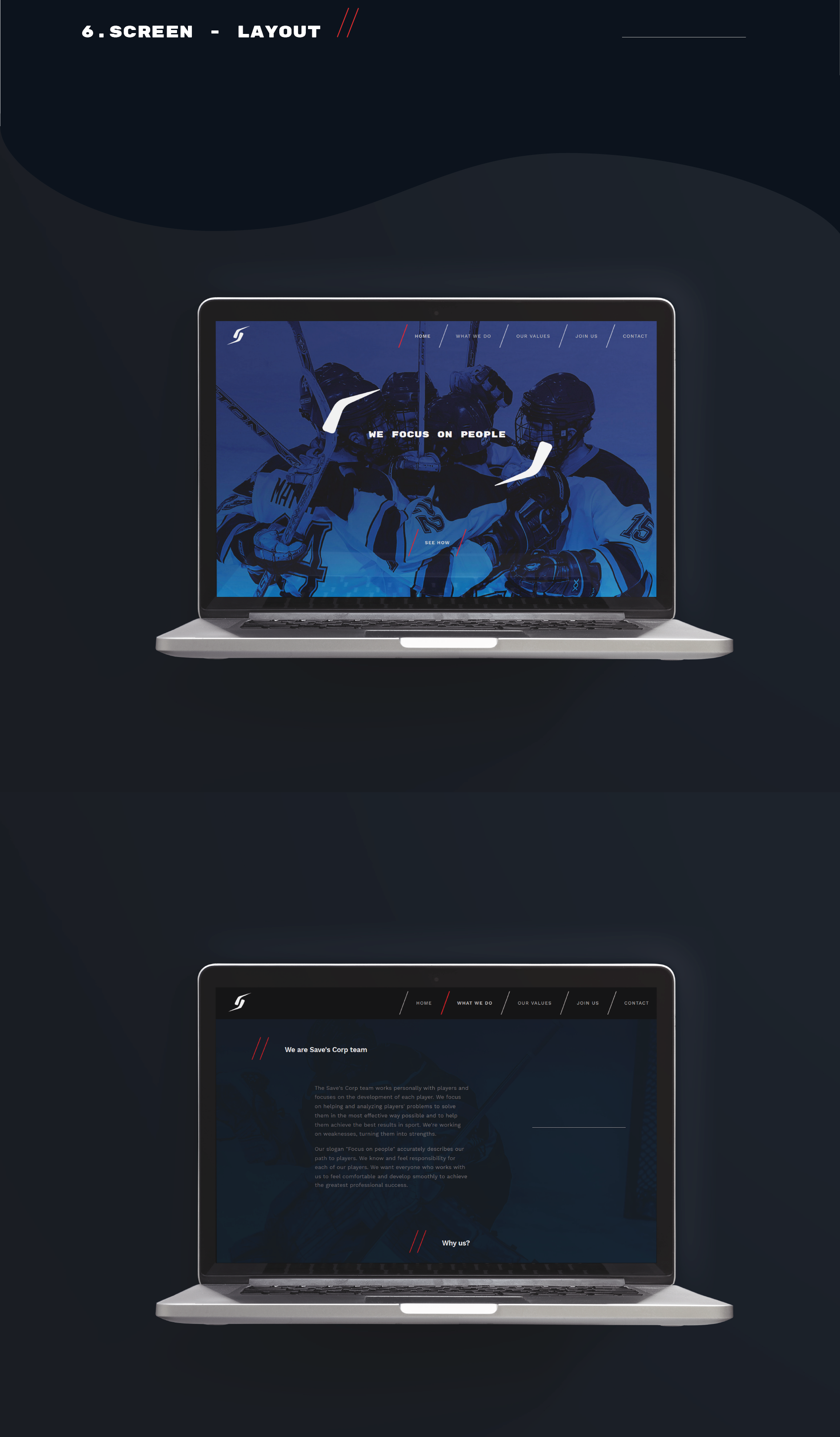
Website and logotype created for the Save’s Corp Esports E-sports team. The main assumption of the project was to refer to the company’s characteristic letter “S” along with Glitch-Art motifs.